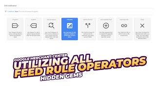
Featured postsView all featured posts Launched: Make changes to existing implementations of consent mode in 2024 Announcement Hi Google Ads Community Users, What s changing? In November 2023, Google introduced two additional c… 0 Updates 0 Recommended Answers 7 Replies 29 Upvotes Launched: New troubleshooter for Performance Max spend Announcement Hi Google Ads Community users, We've launched a new troubleshooter on the Google Ads Help Center tha… 0 Updates 0 Recommended Answers 9 Replies 378 Upvotes Launched: New simulator content for the Merchant Center Announcement Hi Google Ads Community users, We've launched a new Help Center feature that we think will be really… 0 Updates 0 Recommended Answers 43 Replies 527 Upvotes Useful links Product Feedback FormWant to become a Product Expert?About the CommunityCommunity OverviewContent Policy Product Feedback FormWant to become a Product Expert?About the CommunityCommunity OverviewContent Policy Not what you're looking for? Try posting to the public help community Post a question VideosView all videos 0:06:19 How to use all operators in Google Merchant Center feed rules. 4:15 How To Install Google Ads Conversion Tracking For Shopify 4:56 Simulate Smart Shopping With Performance Max Community GuidesView all guides How to Fix Google Merchant Center Suspensions In this community guide, I want to help you navigate the most common reasons for misrepresentation, … 0 Updates 0 Recommended Answers 18 Replies 17 Upvotes Fixing a Suspended Google Ads Account: A Step-by-Step Guide "Your account has been suspended." This notification is enough to make any advertiser break out in a… 0 Updates 0 Recommended Answers 36 Replies 27 Upvotes How To Overwrite Product Information in Google Merchant Center Using A Spreadsheet? In this guide, I will explain how to overwrite your product information using a spreadsheet. First w… 0 Updates 0 Recommended Answers 2 Replies 8 Upvotes CategoriesView all postsSetup and basics Our ads are eligible and approved, but not running + support manager is ignoring all the time. HOW? Why does it say my bid strategy is miconfigured? No Eligible Accounts - Cannot "Post" from the Google Ads Editor to the Google Ads View allAd approval and policy How to fix / appeal a 'compromised site' when I don't have any policy issues? Ads under-review YouTube Ad Requirements – Automated Content Policy Decision View allBilling I've spent $500, how will the promotion credit of $500 be applied? Why i m. Still facing suspended account Requested a Payment Profile Change, no action for 2 weeks View allLearn with Community Guidance How to start making accounts. Google Digital Garage course 'Fundamentals of Digital Marketing' is locked. Seeking solution! Google Ads Account Suspended? View all